Building a management platform as a communication tool that can be automated for Haulers
THE CHALLENGE
Haulers who work for Poplar need a way to easily navigate routes and maintain communication with customers at all stages of their service.
MY ROLE
I was responsible for collecting data, building information architecture, sketching, wire-framing and testing the product, I led usability testing.
THE SOLUTION
A navigational mobile app that facilitates pickup and drop-off, keeping the company informed of the progress of delivery orders.
TOOLS USED
Figma
Maze
TIMELINE
3 weeks
a better way to recycle leftovers
Poplar provides a smart organic food waste removal system for composting that makes it easier to live sustainably.
Poplar is a closed-loop system that collects customers’ waste and tracks their carbon footprints. Poplar partners with haulers across the nation to help swap out customers’ food waste bins and take them to facilities for composting, as well as providing other services to customers.
THE PROBLEM
Currently haulers use excel sheets and Google Maps to find information on each customer's desired service and where to locate them. Given this system, it is difficult for drivers to find customers and manage their daily tasks.
_ _ _ _ _ _ _ _ _ _ _ _ _ _ _ _ _ _ _ _
THE CHALLENGE
Create an app for drivers to use when they are going on their routes to complete their daily pickup/delivery tasks.
Observing Comparators & their basic features
Understanding our comparators was key for moving forward in our research. In an assessment of the strengths and weaknesses of our comparators, we identified gaps in service management, surfacing strategic opportunities for our product. We looked at 6 comparators:
Mentor DSP app, Chime APP, Trucker Path Ap, Amazon Flex, Coolfire Core, Uber Driver App
We found similarities in the layout of their screens. The features offered to their users included:
-
Task management on homepage/dashboard
-
Current, upcoming and pending tasks
-
Progress bar some sort of indicator that shows status
-
Show the driver his current location and ETA
-
Way to contact administration about any issues or claims
-
Upload photos for proof of delivery
-
Access to writing notes in customers service orders
Interviewing Drivers
After finding basic functionalities offered by our comparators, we decided to interview 5 people that drive for delivery services like Mentor DSP, Chime, Uber, and Amazon Flex to understand in depth what drivers working for these company are doing regularly to fulfill their delivery tasks on route. We gained valuable insights about their experiences with delivery apps.
Quotes:
"While I was working for Amazon Flex I didn't have an issue receiving multiple orders, because of the way that was shown on the screens"
"I think is great that through Uber drive drivers and riders can both leave reviews on each other’s profiles"
"I like how Amazon Flex organizes routes for you. The routes are organized from closest to furthest, so you’re not wasting miles"
"It's important to being able to report complaints through the app if you need it to"
-Chime driver
"Sometimes I feel overwhelmed by notifications, if you're driving you can only check the route"
-Mentor DSP driver
.png)
Problem Statement
Through affinity mapping we discovered embedded patterns of thinking. We used this method to see which ideas are most common within our of interviews.
Insights and trends:
I want to easily verify drop-off/pickup
I want accurate information to know the correct location
I can connect with customers for check-ins or issues if I need to
I want to be informed of my schedule and view all my trips/tasks
Understanding and grouping trends gave us a sense of where most people’s driving for delivery services think and what they value the most in their work routine. That led us to our problem statement:
Poplar's drivers need an all-in-one way to view their task information, optimized routes and communicate with customers on route, so they can efficiently complete all of their assigned tasks.
To address that problem we brainstormed "how might we" statements:
-
How might we help Poplar's drivers to perform their jobs in the simplest way possible?
-
How might we help Poplar's drivers to keep track of their routes?
-
How might we offer a way to view all their customers’ information so they can complete their tasks efficiently?
-
How might we help Poplar's drivers view necessary information on the route so they can have a seamless driving experience?
-
How might we help Poplar's drivers to contact administration with customer questions, comments, and concerns?
Prioritizing Features
After completing research, we recognized the big scope of this project, and before moving forward to the design phase we decided to create a "Feature Prioritization List" planning out the order of features that our team needed to work on. It was critical to prioritize features because we had limited time and too many potential features.
We used the MoSCoW prioritization method, also known as MoSCoW analysis, to manage requirements. The acronym MoSCoW represents four categories of initiatives: must-have, should-have, could-have, and won't-have, or will not have right now.
Converging on a design
After 7 design studio sessions, we built low, mid, and high fidelity screens that we later wire-framed following a design system, implementing accurate spacing, headlines, and buttons showing exactly how the the app's screens would work together, using the color palette and imagery that our client provided us. Our app's flow was broken down into 3 stages:
Pre-Inspection
-
Sign In
-
Welcome
-
Materials needed for the day
-
Daily Tasks
-
Profile Image (optional)
Route Overview
-
Hamburger Menu
-
Settings
-
Account
-
Contact
-
Itinerary of Routes
-
Today’s Date
Post Trip
-
Customer Order View
-
Report Complete Trip
-
Report Incomplete Trip
-
Finish Task Input Screen
-
Today's Summary
Screens
Onboarding Overview, Materials
Onboarding Overview, Vehicle Inspection
Onboarding Overview, Daily Stops
Low
Mid
High
.png)
Evaluation & Findings
We performed 2 usability tests, recruiting a total of 32 participants through social networks and Slack. Participants were asked to use the prototype through Maze and complete a series of designated tasks. The score for this initial test was 68%.
The tasks given to our users were the following:
-
Going to the first customer’s location
-
Completing the service the customer requested
-
Going to the next customer to complete another task
-
Reporting a contaminated bin to administration
-
Leaving work for the day before completing all the tasks
The overall impression for each round of testing was positive, however, after checking mis-click rates we identified certain screens with a high rate of failure.
Quotes:
"All of the steps were easy to understand and complete. However, the only issue was with the 'complete' and 'incomplete' button, I was not sure if I was supposed to upload a photo and weight prior to filling out that the job was not able to be completed."
"Nothing was particularly challenging or confusing. One thing that I had trouble with was whether I needed to comment on what I saw that was contaminating the second customer's bin and whether I needed to still record the weight."
"Great app! Very intuitive and easy to follow. I think the last step where the driver has to sign out to indicate that they are done for the day could be another button instead of having to sign out of the app."
"It felt intuitive for most of the tasks-for the last task I was expecting to see an option to report that I was unable to complete the pick up before I could sign out or end my route, or maybe a pop up with a question asking if I was done with my route.”
Final Touches
We explored solutions improving the layout of some of our screens based on the feedback and findings from our usability tests.
Some of the changes that we made were the follow:
.png)
-
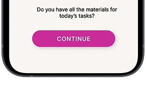
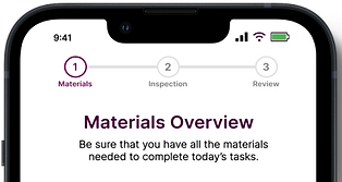
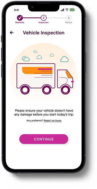
The materials overview instructions were rephrased and moved to the top of the screen to clarify for the user that this screen is only a reminder.
-
Reworked and eliminated animation of the truck illustration to make it look less like a call-to-action.
.png)
.png)
.png)
-
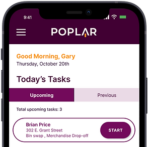
The start button was changed, instead of having one "call to action button" we made the whole section a big button.
.png)
-
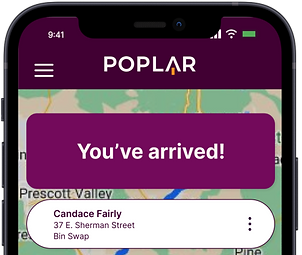
The style of the “You’ve arrived” banner was changed and we made the entire section clickable.
.png)
.png)
.png)
.png)
-
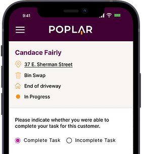
The complete and incomplete radio the buttons initially located on the bottom of the screen were moved to the top to give users a better idea of the proper order of actions

.png)
-
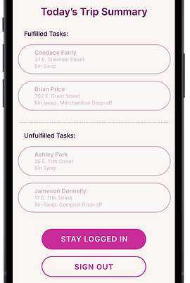
“Fulfilled tasks” were separated from “unfulfilled” making unfulfilled inactive to guide the user to the active tasks.
-
The option to stay signed in or sign out was also added in this screen.
.png)
.png)
-
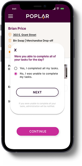
The “finish” button was incorporated, which facilitates the sign out process.
-
If the user chooses to finish tasks, two pop-ups will show to input information. This will notify administration.
The final iteration shows the entry point expanded when users are on the homepage and continue until the completion of their daily route. Due to the success of this layout, this entry point is now a permanent part of the product.
Final design
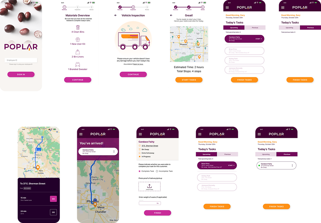
Sign In Screen
Materials Overview
Vehicle Inspection
Pre-Trip Review
Homepage - Upcoming Tasks View
Homepage - Previous Tasks View
.png)
Task - Start Route View
Task - Arrival Route View
Customer Order View
Home- Next Customer View
Home- Previous Task completed View
Prototype

What I learned
-
Working on this project made me realize that even though we were building an app focused on the user we sometimes "overdesigned" or included elements like animation could distract the user from the completion of the task. So simpler is better.
-
Communication with teammates is key. it was enriching to have a group of talented people all with different ideas and skills, but to ensure effectiveness during the timeline given, we did regular check-ins and updates to stay organized during the different phases of the project.
-
Time is precious. We had 3 weeks to complete this project and our client had a goal of launching this app in 2023. We hope in the future that we can keep developing the product and expanding its capabilities to meet user needs.


.png)