
Improving traveler satisfaction at Dallas-Fort Worth International Airport
.png)

Dallas-Fort Worth International provides service to 261 destinations on 28 airlines, and boasts more than 200 shops and amenities. DFW is interested in incorporating a feature for travelers to see their estimated wait times into their current app. This would increase traveler satisfaction and increase airport revenue.
OVERVIEW
MY ROLE
I was responsible for making concept mock ups and sketches and collaborating in visual design & presentation. We followed a UX process that that went from competitive analysis to converging on a design, making mock ups & wireframes, building a prototype and conducting design validations.
TIMELINE
2 weeks
THE SOLUTION
A mobile application with access to real time GPS navigation that enables users to locate and see waiting times for restaurants and other amenities in the area.
TOOLS USED
Figma
Maze

The most connected airport in the world.
The airport comprises 5 separate terminals, American Airlines solely operating out of two of them. Given this configuration, travelers often need to cover large distances between their arriving and connecting flights.
Metrics
-
62.5 million travelers in 2021
-
652 Aircracft movements
-
171.2K Travelers per day
-
200 restaurants and shops
-
17,202 acres
Business Goal
Dallas-Fort Worth International airport is interested in adding a feature to their app for travelers to see their estimated wait times. This would increase traveler satisfaction and increase airport revenue.
User Goal
This app is intended for Business Travelers or family vacationers seeking to navigate this complex airport, Improving time-efficiency across airport's sections and establishments.
The Goals
Users' current experience
Through user interviews, we identified travelers' pain points at airports, what they typically do when they arrive, and what they do while waiting to board. These interviews revealed that travelers often experienced stress due to delays at different areas of the airport.
Some of the insights from our interviews are captured below:
I arrive 1-2 hours before my flight
I check-in prior to arrival at the airport. I expect to get notifications about flight status changes through my phone
I think that security is the most annoying part of the airport
I get stressed when I have to spend a lot of time in lines
I enjoy the restaurants and stores if I have time
I need to grab food quickly if my flight is leaving soon
Research Findings
We found that not knowing waiting times contributed to poor traveler satisfaction, so we recommend that DFW expand the wait-time feature and build out the shops/dining section in their current app. The typical user journey we discovered led us to our problem statement, below.
Users need an effective way to be inform about wait times across the airport, so they can manage their time before their flight.
The Solution
After gathering data, we created personas & task flows to identify the various touch points in the airport's customer service experience. We also created a list of design recommendations addressing the ‘problem space’.
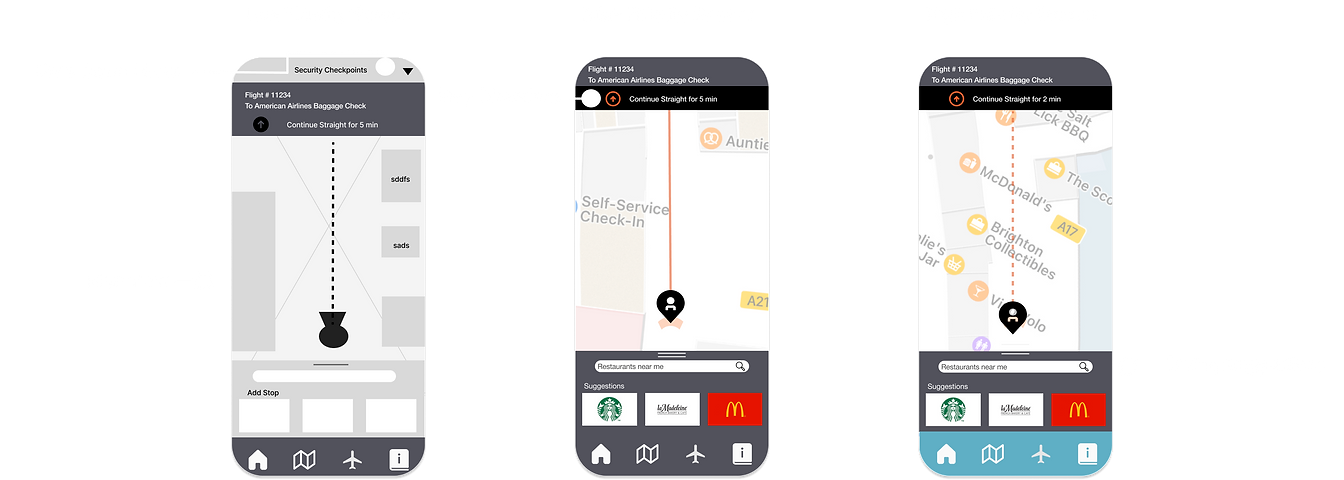
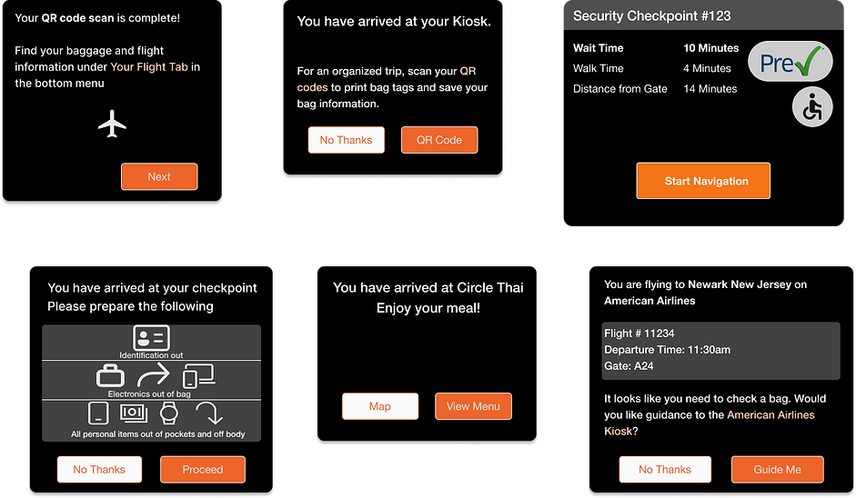
Provide real-time and efficient security line tracking
Display interactive maps and way-finding graphics
Provide information about documents needed
Help in decision making
Users need detailed, continuously updated information about security lines.
By providing maps to users, we can improve the likelihood of them finding what they're looking for, and decrease the time it takes for them arrive to their desired location.
A system that provides an updated list of security requirements currently in place.
Providing the user them with only the closest options with less waiting times, to reduce the cognitive load & increase efficiency.
Analyzing our competitors
We decided to analyze the services provided by directs competitors through their apps. We also took into consideration Disney World as an indirect competitor, because of the nature of their app, which offers interactive navigational maps to its users.
Denver International Airport
Atlanta International Airport Airport
Disney World
Chicago Midway International Airport
Los Angeles International Aiport
.png)
Only DFW and Disneyland consider wait times as a part of the map
Other airports do not have option to booking for parking ahead of time, Just DFW.
Only DFW has mobile ordering
⅘ airports have food and shop options
⅗ airports include flight information
⅗ airports include your location on the map
Designing solutions
During this phase "design studio" was the method to brainstorm ideas through sketches. After various design sessions and iterations we came out with 3 user flows for our app's layout.


Challenges along the way
We conducted moderated and unmoderated usability tests. Gathering quantitative and qualitative data, to ensure that the features, layout and overall purpose of our app was intuitive and experienced as intended. However, by observing our pool of 10 users interact with our prototype, we noted some levels of confusion. Some users didn't know what to do next in order to complete certain tasks.
The three tasks participants were asked to complete include:
-
Navigate to their airline kiosk to check a bag.
-
Navigate to security and go through the checkpoint.
-
Find somewhere to eat with a short wait time.
Findings:
-
The button 'Proceed to Gate' is confusing to most users.
They usually hit the orange button as a call to action. The placement, color, and text of the button could have all contributed to the participants' confusion.
In our final prototype we rephrased the text in our two buttons. Users will be guided to continue their journey with a primary button, while maintaining the option to go straight to their gate.
Direct success: 77.8%
Avg Duration: 81.7 seconds
Misclick rate: 46.2%

Users are likely to choose the options presented in the primary button; keeping that in consideration we reworded all the primary buttons showed below.
.png)
Direct success 50.1%
Average Duration: 37.5seconds
Misclick rate: 41.9%
Indirect Success: 66.7%
Average Duration: 37.3 seconds
Misclick rate: 44.4%
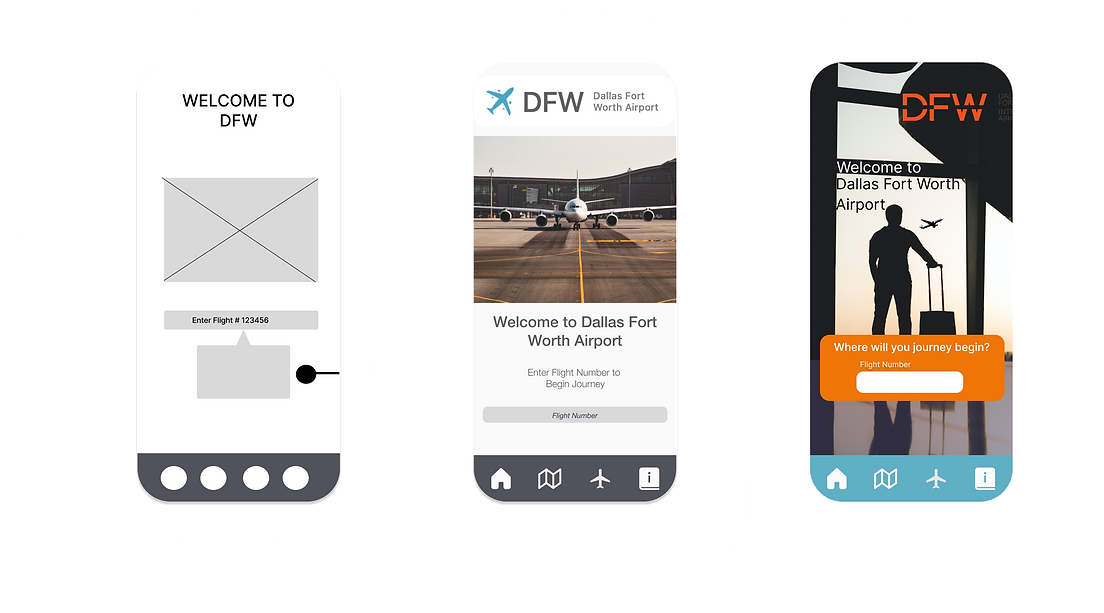
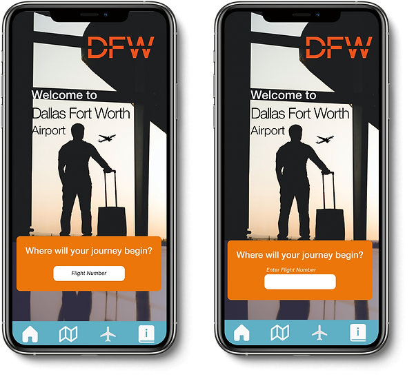
In our final Design we placed the label originally located in the center above the form field, So it's more noticeable to the user where to input flight information.
-
The flight number input was not clear to users as the first step in the journey.
Final Design

Next Steps
-
Continue tracking the level of engagement with the app through more rounds of usability test.
-
Add features including waiting times in charging areas, bathrooms, and family friendly spaces.
-
Add flight time features and individual ticket reminders into the app.
What I learned
-
Think out of the box. Design studio sessions really were effective to shape our app, with all the group members participating we gathered unique ideas that we were able to combine and refine together.
-
To always be open-minded and speak out if you have an idea, the best designs were developed through the inclusion of aspects from multiple other ideas, which were then refined to cover divergent types of needs.